
How to promote a secret?

In this month of February, we are very proud to present to the public our new experience, the Cabinet of Curiosities (you can read all the details in my previous blog and on our dedicated web page). With the Cabinet of Curiosities, we want to create an exclusive and intimate experience for a handful of privileged participants, to take them by the hand and lead them through an evening filled with fun surprises and sexy moments, wonderful discoveries, and extraordinary stories. Add to that unlimited bubbles and themed treats, and you have all the ingredients for a truly spectacular evening!
Our desire has always been to make the Cabinet of Curiosities as private as possible. We want the experience to be shrouded in mystery, so that people feel like they are admitted into a truly exclusive place that not everyone has access to.
And obviously, we would need visuals to promote the experience, which is always a very nice (albeit sometimes challenging!) step in the process. The key is to manage to grasp your desires and make them clear enough so that a graphic designer can take your idea and make it shine. Frances and I briefed many artists when we were working in the video game industry, so we are deeply aware of the importance of clarity and attention to detail when we convey our ideas to a third party.
But how to promote a secret?
We didn’t want to use photos of our actors, because people might think those are necessarily the characters they will meet, while the interest of the Cabinet is precisely that the characters change every month. And we also didn’t want the poster to explain too much about the content of the experience.
So we reduced our Cabinet to its most basic components, based on our slogan: "3 doors. 3 stories. 1 extraordinary evening." Why not focus our poster on those 3 doors? We would make each door very different to illustrate the fact that no experience and no character will be the same.
Our graphic designer therefore created this poster for us:
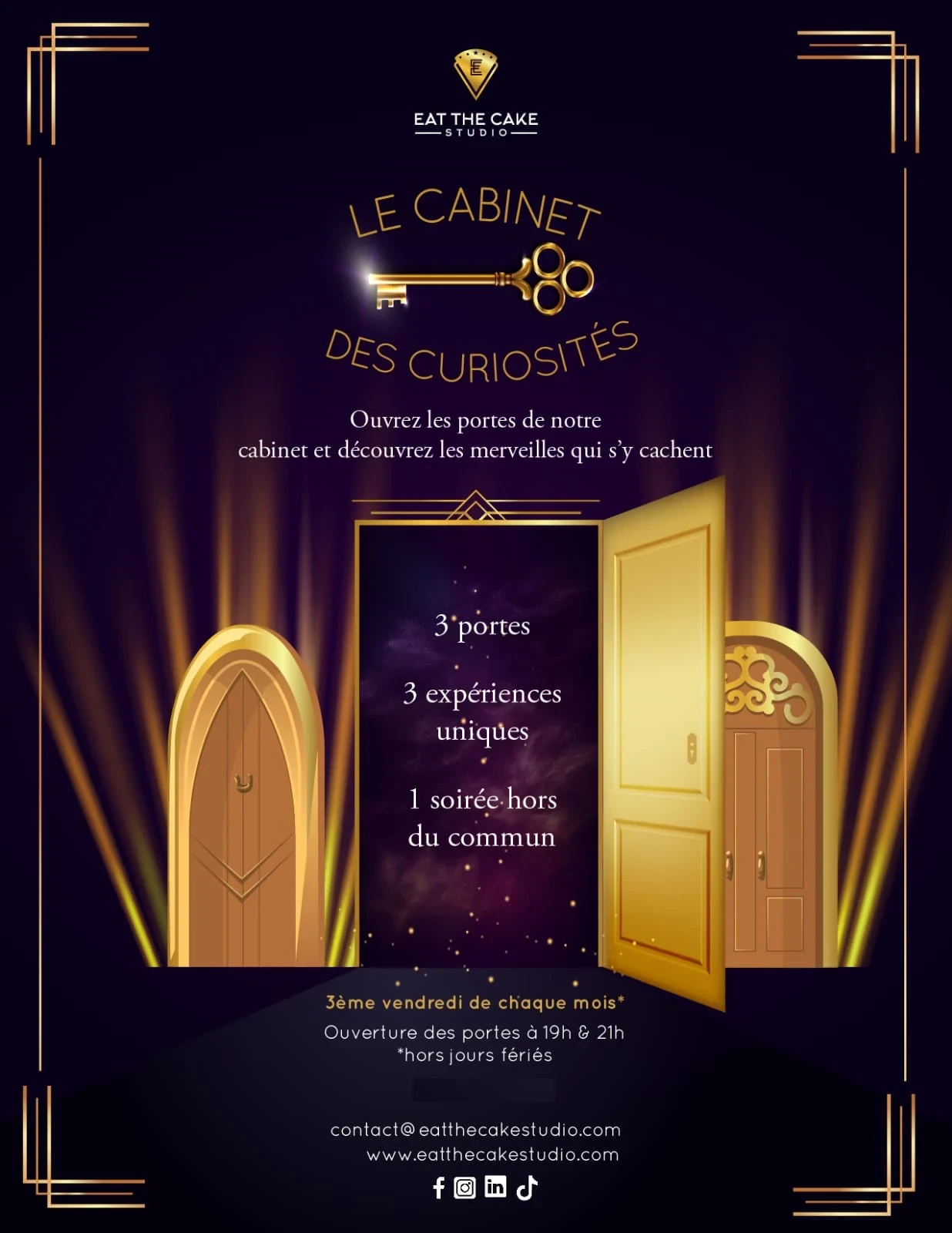
I think we can agree that we went a bit overboard with the gold. 😅
The elements of the poster were magnificent, and overall it perfectly corresponded to ETC’s aesthetic, but after a few days of reflection, we agreed that we had not yet found the magic formula. The poster didn’t say enough, while apparently saying too much by putting so much emphasis on the doors.
So we went back to the drawing board.
We went back to our slogan: "3 doors. 3 stories. 1 extraordinary evening."
If the doors caused too much confusion, maybe we should focus on the stories. The books seemed to be the obvious illustration of this concept, especially since, for now, most of our characters are either historical figures, or novel characters, which in both cases means reading a large number of books to find the best anecdotes and the least exploited stories.
Of course, we would need to add something to these books so as not to give the impression of advertising a new library. I have always loved the superb opening credits of the TV series "Only Murders in the Building," which shows silhouettes in windows of different colors and lets you glimpse all the hidden stories inside the building.
We decided to mix the two concepts by inserting windows into a building made of books, and we created this (very rough) mock-up:
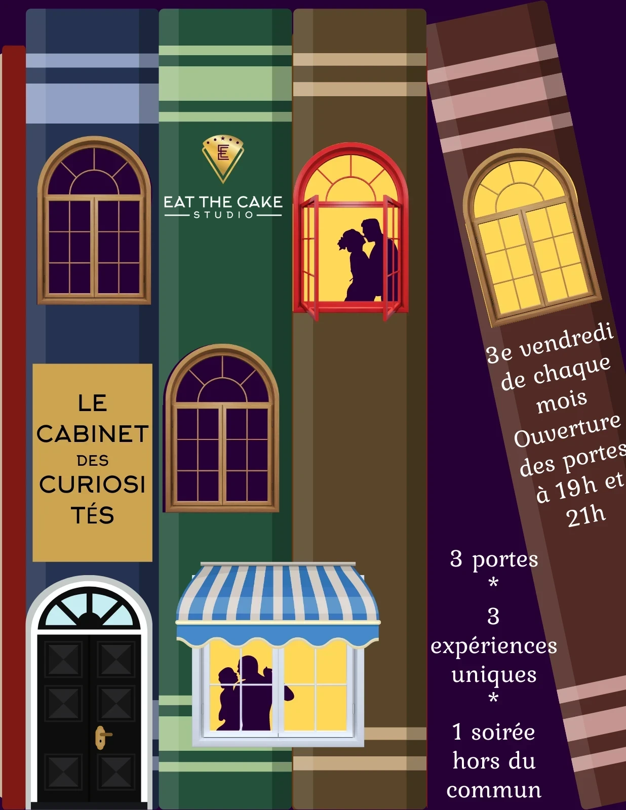
We were fans of the concept, but it immediately became clear to us that despite the windows, the books took up too much space, which gave the impression, at best, of an ad for a new novel about a mysterious community.
However, it was also clear that the windows with the silhouettes were a really appropriate illustration of our experience. Also, one of our concerns had always been that people don’t understand where the Cabinet was held, since the exact location in Paris changes from month to month. We had always thought that showing a simple building would make the visual boring, but the mock-up above made us reconsider the matter.
We therefore created a new mock-up, trying to find a building that resembles as much as possible a Haussmannian hotel to keep a Parisian look, and here is the result:
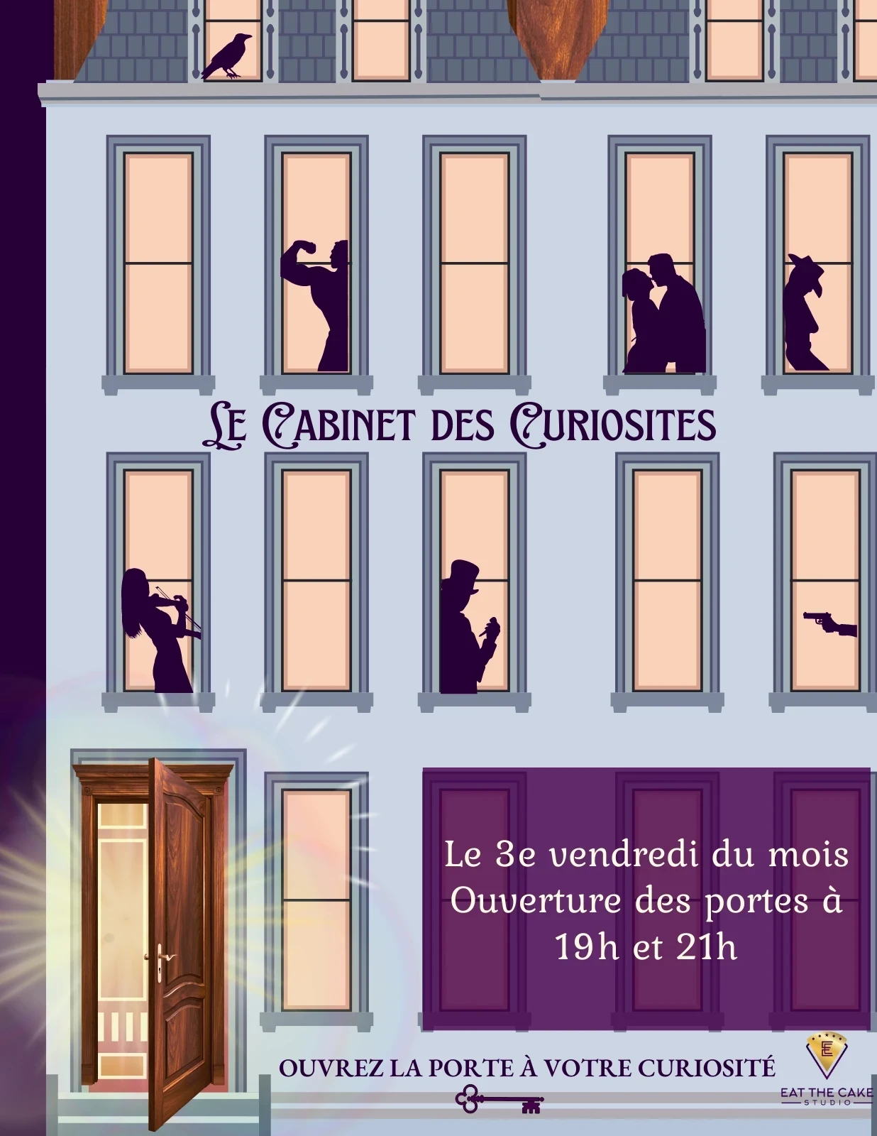
We clearly found the winning idea. The poster looked a bit like an ad for a play, but since our immersive experiences are based on interactive theater, it suited us perfectly. We sent the mock-up and our specifications to our graphic designer, and she transformed all that with a wave of her wand into a cleaner, less cluttered version that perfectly matches our colors and aesthetic. Here is the final poster you have seen on our social networks:
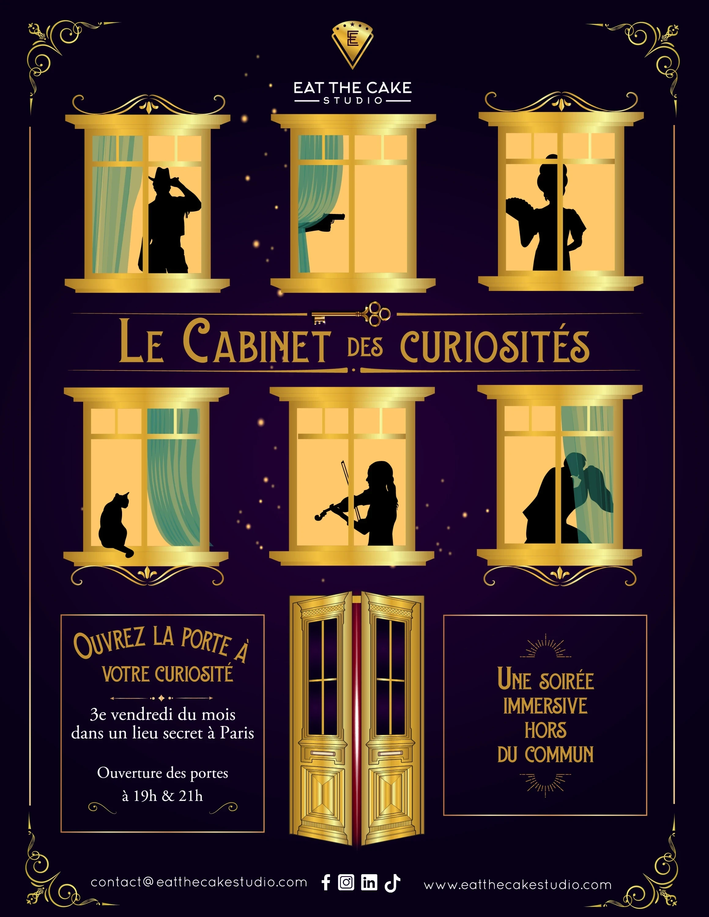
We love this poster. It highlights all the important aspects of the experience (there are several completely different characters, it takes place in a private building, and the whole thing is elegant and fun) without revealing too much about what people can expect… exactly like this post!
We hope you enjoyed this little glimpse behind the scenes, and that this blog will entice you to visit our Cabinet of Curiosities very soon!